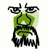
MyPyramid MyPortrait
Once upon a time a pyramid meant something. It meant less bricks at the top than at the bottom. That's how you built them. It's what defined them. Try building them a different way and they fall over, or you end up with a tower. Less at the top and more at the bottom. It's what differentiated a two-dimensional representation of a pyramid from your regular every-day triangle. However, this is America in the 21st Century, and nobody can be a loser. Nobody can be at the bottom. Not even a food group. Or a color.
Democracy for Diagrams
So the US Department of Agriculture's new ingenius 'MyPyramid' has all food groups making it to the top. How democratic. If the schematic that is the London Underground Map was designed in this manner we'd have fifteen concentric Circle Lines and nothing else.
The American Dream
Note how the official USDA line has each color starting at the top - rather that the bottom - and then getting fatter as it progresses down. It's the American Dream. What the USDA have actually done isn't a pyramid. They have given us a graphical chart showing proportions, and nothing else. There's nothing wrong with that but it's not a pyramid; it's a pie-chart, or pizza-chart if you like. And that really is perfect for America, the land where you can have your pizza and eat it too.
Figurative Art, not Hard Edge Abstraction
The government's new food MyPyramid features six bands of color that extend vertically from the tip to the base, each representing different food groups. It comes in 12 versions, depending on a your activity level and caloric need. Exercise is stressed by a figure of a person climbing steps to the tip, so alas we are not competing with Ellsworth Kelly and Frank Stella with our hardline color abstraction - but instead we have a touch of Keith Haring's figurative art.
Eating in the Dark
Reportedly many food companies are embracing MyPyramid and plan to put the graphic on the packages of their products. Luckily the official government website has different versions of the graphic for your use, including the very helpful black and white one - where all food groups (bricks?) are created equal. More Rheinhardt than Rothko, it's the thinking man's (and woman's) guide to eating in the dark.
The Colors
Here are those groups by color, with advice on what to eat, based on a 2,000 calorie daily diet, but don't try this at home.
ORANGE: Grains. Used to call them carbs. Eat 6 ounces. Ensure half are whole-grain. Shown as a wide band to show you should eat more. So eat more. Don't have kids who don't eat crusts. Don't have kids.
GREEN: Vegetables. Eat 2 1/2 cups. Eat more dark-green veggies or turn the lights off. Eat more orange ones too. Think Hallowe'en. Another wide band.
RED: Fruit. Eat 2 cups. Any format but that's enough juice. Not quite as wide a band to show you that fruit is much over-rated and often awkward to unwrap.
BLUE: Milk. Drink 3 cups so if you live alone you really don't need home delivery. Try walking to the store. If there's no sidewalk thnk of yourself as Hawkeye The Pathfinder, and then ask your city why. Consume all milk products, with less fat. A wide band. If milk was black, would you drink it, Longrifle?
PURPLE: Meat and beans. Eat 5 1/2 ounces. A meal in itself, but vary it and go lean. Don't just go lean; go camping. Catch a turkey. A narrower band, because we all know you're not going to catch that turkey. In fact we all know that you're not even going to go camping. Just remember, a turkey is for life, not just for Thanksgiving.
YELLOW: Oils. Get most from fish, nuts and vegetable oil. Limit solid fats and salt. Don't choose added sugar. Choose life, choose a job, choose a career, choose a family, choose a big television. Choose washing machines, cars, compact disc players and electrical tin openers. In other words, choose your oils carefully. As bands go this one is a thread.
Actually the point of the thing is the prefix, the 'My' - it's meant to be personalized. Throw my age, gender and physical activity at MyPyramid and my figures come out as:
9oz Orange not 6
3 1/2 Cups Green not 2 1/2
2 Cups of Red (the same)
3 cups of Blue (the same)
6 1/2 Purple instead of 5 1/2
8 teaspoons of Yellow
I'm going to paint a self-portrait using those ingredients, but first I'm off to bed, after having some fish oil on a slice of whole-grain toast. With the lights off.
Paul Dorrell cautions:
"Will you suffer? As surely as you eat, drink and breathe."


0 Comments:
Post a Comment
<< Home